Sidebar
An online article tool providing quick access to contextual information so readers with various degrees of familiarity on the subject can efficiently understand the story.
BACKGROUND
Publishing a story requires a constant balancing act: the story has to get to the point, but the audience may not be fully up-to-speed on the content. Web links attempt to solve for this but run the risk of sending users down a rabbit hole, never to return. We sought to create a solution which could present information for extreme users who are subject matter experts & novices.
CHALLENGE
The same news story has to cater to readers who are both ends of the spectrum of subject familiarity, those who are experts and those brand new to the topic. These users want to quickly read and understand the article, yet want to understand contextual information that is critical to understanding the story.
This project sought to balance the forces of focus & brevity vs curiosity & completeness.
TEAM
The team consisted of 2 product designers, and 3 developers.
Solution
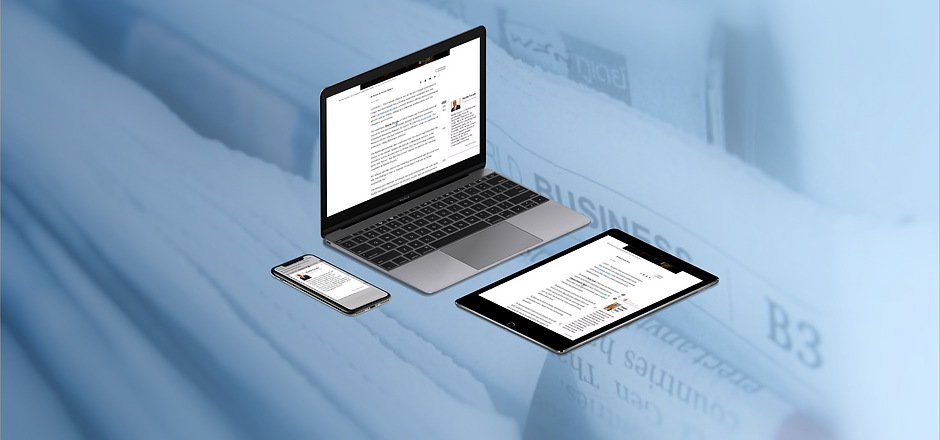
MVP Product and Ideal State Designs for Mobile & Desktop Experiences
Sidebar is an experience that maintain the brevity of an article for knowledgable readers, and signifiers for other readers to explore and view important contextual information. With more content being consumed on phones, we designed with a mobile first mentality and then scaled those patterns to desktop.
Through 10 weeks, my team and I were able to work through 4 sprint cycles in which we conducted research and testing with 20 different users, developed 5 different design directions, narrowed down and refined one final design, and provided guidelines for best practices for future development of this project.
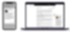
Two developers on our team also created a working MVP with React, HTML, & CSS to demonstrate what a working prototype looks like on web & mobile.
Approach
2 Week Sprint Cadence
We worked on a 2 weeks sprint cycle to create a working prototype of an interface which could cater to both extreme users on the same platform. We followed the process below while creating multiple design iterations, learning from research & test results, and readjusting our prioritizes and goals throughout.

User Research
Hypothesis: Users seek contextual information to better understand articles, but do not be distracted by information that is irrelevant to them or redirection to new webpages.
GOALS
Validate user problem
Evaluate current processes & paint points
Identify a niche area to focus initial prototypes
Evaluate competitive benchmarks
METHODS
Primary interviews- we spoke with 10 users initially to understand their reading behaviors
User activities- users highlighted text on articles and had them think out loud while reading
Benchmarking- Existing solutions that provide contextual information were analyzed & tested

Analogous Research
We had users walk through various benchmark interfaces such as Bloomberg & Wikipedia. Initially we thought these were solid but discovered some pitfalls with key takeaways:
Need clear signifiers for contextual information else it's easy to overlook
Context information needs to be specific and not overwhelming or contain unintended information
Reduce obstruction of the main article body to allow users to still scroll with open context
Minimize animations as seen as a distraction

Insights
Through research with readers, we were able to confirm people's attitudes and behaviors when reading articles and their desire for contextual information. Through observing people's reading habits & looking through benchmarks, we came up with the following initial design considerations when moving forward:
People, places, events, locations, and relationships between people were the items people felt needed context
Mobile design first, as many people use phones for news
Noticeable signifier to access context, but not intrusive
Matches their mental model and is intuitive
Minimize distractions from reading flow
Context is quick and relevant to user

Goal Setting, Ideation, & Prioritization
Each sprint we set goals for ourselves based off of our quarter long goal and learnings from the previous sprint, and then prioritized our ideas based off of the learning and understanding key uncertainties in order to move forward confidently.

Low Fi Prototyping
Created low fidelity prototypes that conveyed an unfinished concept and allowed users to give honest feedback without feeling guilty about criticizing a more developed product. We tests 4 different concepts using paper prototypes and narrowed down to a single concept of contextual information appearing on the side after testing based on user feedback and their intuition.

Mid Fi Prototyping
Created low fidelity prototypes that conveyed an unfinished concept and allowed users to give honest feedback without feeling guilty about criticizing a more developed product. We tests 4 different concepts using paper prototypes and narrowed down to a single concept of contextual information appearing on the side after testing based on user feedback and their intuition.
Multivariant Testing
Visual signifiers are critical to a successful interface. We tested varying cues for a word containing contextual information, as well as linking the cards to their root word.

Insights
From our interviews and multiple prototype tests, we came up with 3 key insights as well as better understanding of key best UX practices to apply to this interface.
Freedom of Choice
Users reacted most negatively to the sidebar that shows all of the context as the article is first opened which is seen as jarring and distracting.
Users require agency in which context appears and not forced to read content they were already aware of or uninterested in. control.
The Essentials
Users also stressed that they want only information, in the context cards, that is essential to the story for comprehension.
They explained that they are not looking to become experts on an issue when reading an article but rather to have a better understanding on the event or story that is being covered.
Recurrent Referencing
Once users had made that choice to learn more, they felt that it was valuable enough to be left open and not disappear, even after it had scrolled off the screen in case they saw the word reappear. In tests users would often scroll back to see previously open context.
General Usability
Signify that a word contains context in a way that matches users' mental model and utilizes recognition
Signify what action to take to open contextual information, matches user habits
Contextual information is visually associated to its root word
Ability to reverse decision and close context instinctually, quickly have error recovery
Freedom to choose what information is shown or not
Help and documentation regarding the interface
Sidebar Designs
Through 4 design sprints, we came up with a final prototype for a mobile & desktop experience.
Mobile Walkthrough
Design decisions made:
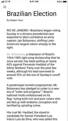
Choice to open/close each context as they need to provide agency.
Contextual information limited to 60 words to be informative yet not overly extensive.
Sets expectations for users where contextual information will appear.
Indicates words contain context and should be clicked to open.
Visually associating contextual card with root word.
Single card for mobile due to space, multiple can be left open for desktop.
Collapsing cards when multiple cards are open & overlap.
Utilizes UX best practices and general usability guidelines.
Interface & Signifiers
Use of tabs, visual elements, and text styles as signifiers for interaction and convey information.

Explanations & Guide
Onboarding information for new users to explain the contextual card

Contextual Cards
Outline various components of the contextual cards

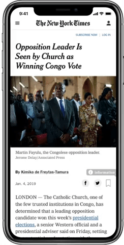
Desktop Walkthrough
Scaling up mobile designs for desktop


Project Learnings
Takeaways as a designer from this process
Make a Hypothesis & Test
When there's limited time and resources, hypothesis and designs must be formed based on instincts to keep the project moving. User research & testing is extremely helpful especially for bigger picture directions, but not possible for every detail.
Constant Communication
In working with developers, we were able to deliver a working prototype, however, we were not able to implement all the features. Constant communication and understanding time and resources needed would allow us to make decisions and begin development sooner.
Mobile First
In today's world, more and more digital content is accessed through the phone. By designing for a mobile which includes many constraints, it's much easier to then scale up to desktop than design the other way around.
Prepare for Surprises
Having seen Boomberg's contextual interface, we thought it couldn't get better. However, we were surprised and discovered insights when people interacted with this supposed gold standard.